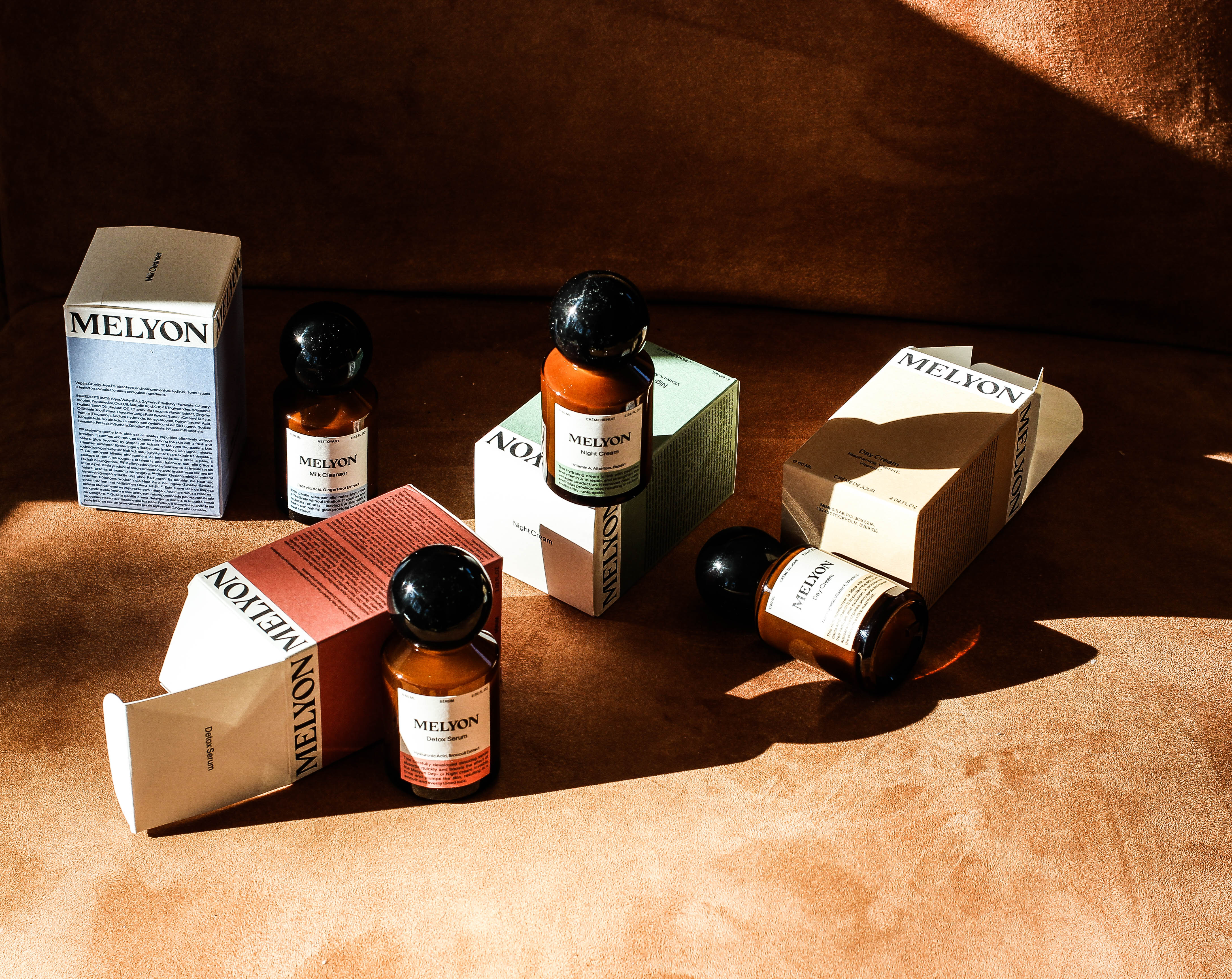
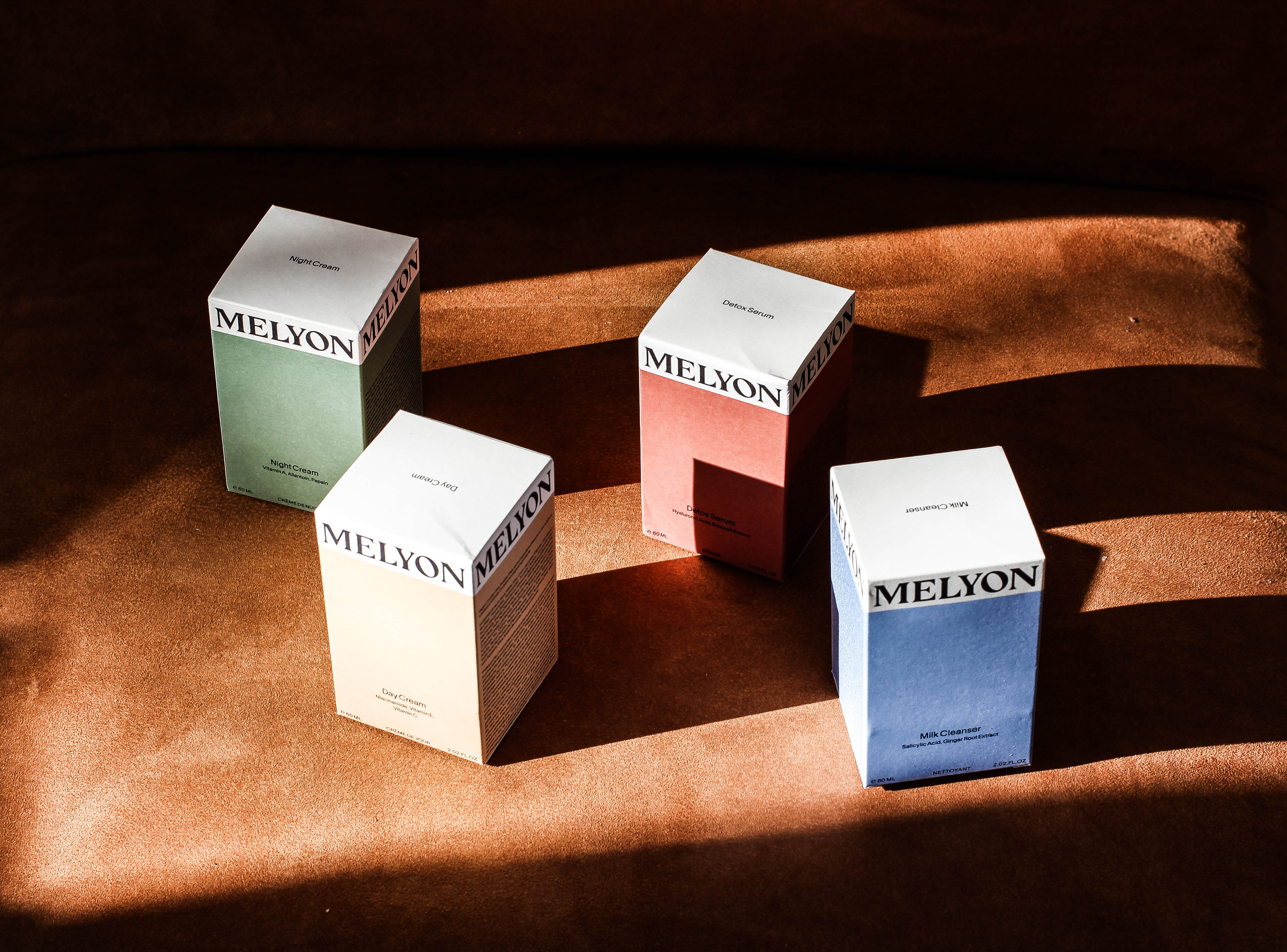
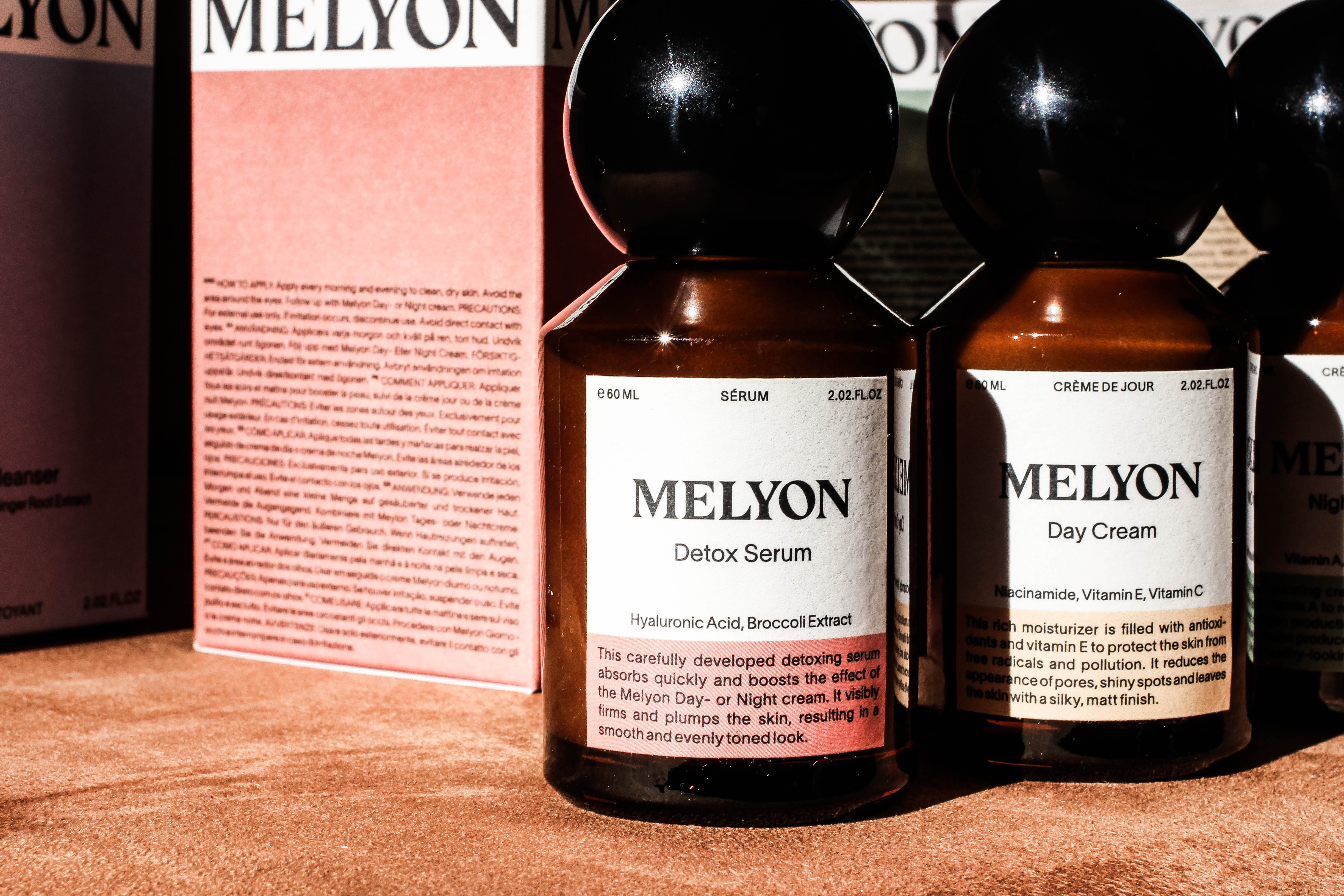
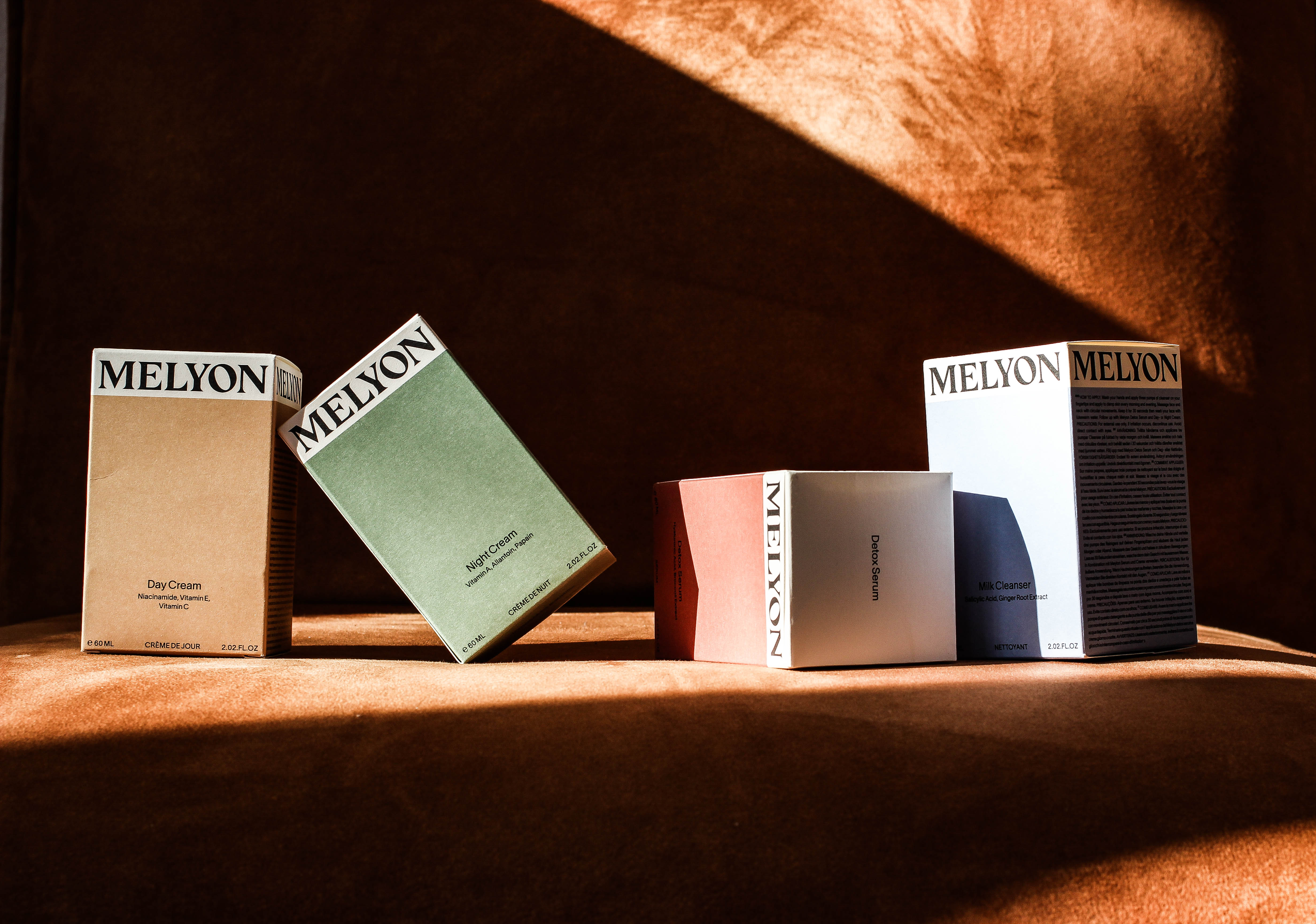
Melyon is a Swedish skincare brand by model Roger Dupé that popped up as a sponsored post whilst I was scrolling on Instagram. I was immediately taken by the pastel toned labelling on the dark umber bottles. The paper boxes are uncoated and are colour coded to signify the different products Melyon currently offers. Though the product line as a whole reminds me of old medicine bottles, this vintage feel is offset by modern fonts by Letters from Sweden and TYPE.WELTKERN®. Additionally, the spherical cap facilitates in adding sleekness and finishes off the bottle’s tower-like shape.
In my hand, the product feels weighted, and the glass feels textured to touch, providing additional grip to prevent it from slipping whilst in use. The Melyon experience is a result of a beautiful journey where product, photographic and graphic design elements come together. I spoke to Stockholm-based product designer Alice Genberg, who brought the bottle to life.
When I peruse Alice’s website, her design style becomes immediately familiar but certainly not predictable. There seems to be an underlying manner of care in all of Alice’s work—taking into consideration what the daily life of an end user might look like. Take for example, ‘The Torch’ (2017), a project in which she seeks to make an ordinary torch, which you may shove to the back of your wardrobe, visible. I’m excited to speak to Alice about her beautiful work, design vision and moreover what her dream projects might look like in the future.
Scroll down to read the interview

Sherida Kuffour: Hello Alice, it’s amazing to speak to you today; thank you for your time. How are you, and what’ve you been up to in the last 14 hours?
Alice Genberg: Hello! I’m all well, spring has finally arrived here in Stockholm and I think we are all in need of some sun these days. I have been working a lot lately on different projects but I was actually off yesterday and it was well needed. My best friend turned 30 but how do you celebrate someone in a pandemic? Well, me and some friends took her out for oyster diving on the Swedish west coast and it was such an experience. To see these wild oysters in this rough environment and to pick and really eat them á la minute, such a privilege! Now I’m back in Stockholm feeling inspired and energized!
SK: Your work deals a lot with the emotional impacts of design on everyday objects. This was clear as soon as I opened my Melyon package; I gasped at how beautiful the umber glass bottle looked. What does it mean for you to communicate emotion in your work?
AG: I have always surrounded myself with things I love and if I don’t love it I would give it away and this has nothing to do with price or status but rather with emotions. Simply things and objects that makes me happy by just existing. I read the book Emotional Design by Don Norman during my first year in uni and it definitely put words on my own thoughts and gave me a quite straight forward direction in my work. To me the emotional aspect is just as crucial as the function and that’s what makes the object something else than just a physical thing, what gives the object a soul. Usable designs are good, but great designs connect on an emotional level.
SK: From your previous work, specifically ‘Coffee Leather’ (2019), you share your thoughts on food waste and the decision to create a sustainable alternative to leather. Did this thinking, in terms of sustainability also affect how you dealt with choosing the material for Melyon?
AG: Yes, definitely. I think a sustainable mindset is a responsibility we have as designers and it should be expected rather than seen an option. For the Melyon bottle the most obvious aspect is the materiality where both the glass and the plastic cap is 100% recyclable. Then we have the amber colored glass which helps protect the content from sunlight and thereby preserving the product and its lifetime, which is another aspect of sustainable thinking. The 60ml size was decided based on practicality when travelling but also from a sustainable perspective where many skincare products tend to come in too large sizes which often makes the content reach its expire date and thereby decrease the strength of active ingredients before actually using it all. We also discussed making different sizes based on the content but by making them all the same size the manufacturing could be done more efficiently. All based on sustainable factors in one way or another.
Interview continues below after the images
Product Design: Alice Genberg
Packaging Design: Wiktor Persson and Carin Nilsson
Fonts in Use: Eksell Display by Olle Eksell and Göran Söderström (Letters From Sweden) and Laussane by Nizar Kazan (Type.Weltkern)
SK: What strikes me immediately about Melyon’s packaging is how elegant yet playful the combination of the round cap comes together on a burly bottle. The result is a product that looks very graphic in silhouette. On your website, you show the bottle’s paper cut-outs where the sizes differ from each other. How did you decide to pair the round cap with that bottle, and how many different prototypes had you considered?
AG: We wanted to create a bottle with a strong sense of identity but yet with a simple and elegant aesthetic. A bottle with references to old school medicine bottles, yet with a playful and modern touch to it. It was a long process of refinement where I made lots of sketches and prototypes to get both forms and proportions right but also to optimize function and usability. The result is playful and elegant, yet refined to the bare minimum and I believe that’s some sort of reference point and direction for what I want my work to be. My old teacher from Central Saint Martins always teased me saying everything I designed was ”round and black”which sort of became my trade mark in school and apparently still is, haha.
SK: The coloured cardboard packaging, which Wiktor Persson and Carin Nilsson designed, compliments the bottle very well; in how far did your bottle design influence the graphic packaging, or was it the other way round? Could you talk me through the collaborative design process for Melyon?
AG: Me and Roger started discussing the design of the bottle at a quite early stage in the project, before even the name was completely decided, which was exciting because we really started on a white sheet of paper and it sort of set a direction for the whole identity of the brand. It was a very collaborative and enjoyable process from sketch to final product and a privilege to be a part from the start. The graphic packaging that Wiktor and Carin made came later and I love how well they play together. Both the bottle and the packaging are quite playful on their own but together they create a strong sense of graphic and confident elegance as well which gives the whole brand a strong and distinct character.
SK: Moving forward, what does your dream project look like? And if you’ve already completed your dream project, what was it?
AG: Spending more time at home has made me, and I believe most of us, more aware of how our home environment affects us so lately I haven’t been able to stop thinking about designing and building a summer house for myself which would be a dream come true. Currently I’m imagining a wooden house in knot free pine treated with tar oil with deep window niches and big window-glasses mounted on the outside of the facade, Sigurd Lewerentz style. I am also currently very much into handcraft and I recently bought a ceramic wheel and a ceramic oven so I’m setting up a small ceramic studio which I can’t wait to use. During the summers I’m running a café in my families summer house so one project that has been a dream project since we started it four years ago has been to make all plates, platters and coffee cups for it. A dream project that finally seems closer and closer!


Dear Reader,
Thank you for reading thus far. This journal chronicles various personal interests, ranging from design critique to sartorialism and beauty and photography. What ties all these subjects together is the understanding of myself as a consumer and as a designer who sees these things as inspirations of my trade and therefore wants to reflect upon them. the purpose is in the process of journaling, not the polished result. I hope you enjoy it all, and thanks again for stopping by.
Where to start?
Read my first post, ‘Salut, Salut‘ to learn about my blogging history,
or ‘The case against personal branding for designers‘, where I share how the design of this website came about.
Alternatively, I also have an interview with my developer, who made a lot of what you see possible.
Warmest
Sherida
The copyright to this content (photo, text and all related media) belongs solely to me, Sherida Kuffour. Any form of usage without my explicit permission is an infringement of those rights.